MY ROLE
Sunny Lee - User Researcher, Interaction Designer, Information Architect, Visual Designer
DURATION
2 Weeks
CLIENT
Portal VR - (A variety of fictitious clients and personas were provided by GA)
TOOLS
Sketch, InVision, Omnigraffle, Pen & Paper, Post-Its, Whiteboard, Google Slides
PLATFORM
Website
OVERVIEW
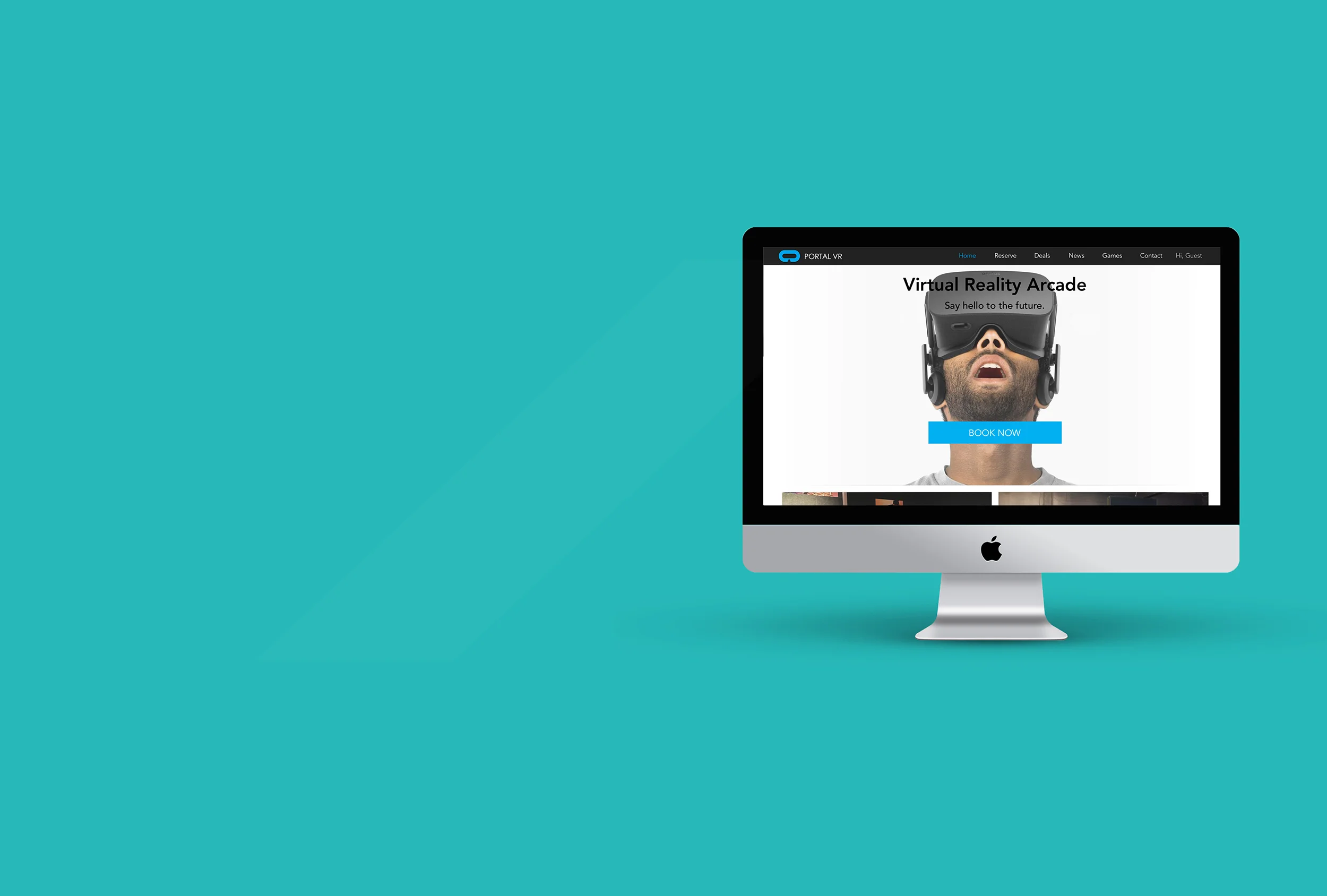
Portal is a virtual reality arcade located in Ballard, Seattle. Being new to the area (established in Oct. 2017), their constantly shifting business model, due to seasonal demands has created a website that’s difficult to understand and leaves the burden of explaining their unique pricing structure and policies to the staff.
THE APPROACH
With 2 weeks to complete this project, I budgeted 3 days for initial research, 4 days for interaction design, and the following 3 days would be dedicated to testing and refining. Any residual time would go to the visual design and the preparation of my presentation.

INITIAL FINDINGS
CUSTOMER SERVICE
The experience has a relatively steep learning curve and requires the employees to assist with waiver signing, game setup, recommendations, keeping track of users’ playing times, tending bar and concessions and disinfecting equipment between users.
RESERVATIONS & EVENT INQUIRIES
Due to the high customer assistance levels, employees are not always able to follow up on event inquiries right away. Unfortunately, many reservation and event inquiries still come in through phone calls.
PRICING & BUSINESS MODEL
Competitors have simpler pricing and rewards programs that don't require as much explanation. Since many of the customers are unable to understand the pricing structure on the website, it often leads to customers calling in for clarification. Due to constantly shifting seasonal demands, Portal finds themselves shuffling prices, stores hours and has a difficult time staffing.

Derek Tseng being assisted by manager with fitting headset, controllers and game setup
PERSONA
In the user experience field, we use personas to portray customers that the business would like to focus efforts on supporting. Personas are often used to facilitate discussions about users’ needs and varying contexts of use.
During my site visit and after observing the customers, I selected Daniella Walters (picked from a set of 3 provided personas) to represent the business’s key demographic. Her needs for making clear choices and finding products easily was a great opportunity to help realign Portal’s service with user goals.
Provided by General Assembly
THE VISION
Focus on the usability and convenience of the website. The site navigation should be simple to understand and the information provided should be clear so new customers don’t have to call in for clarification. Since encouraging loyalty is also a great way to retain existing customers, Portal also needs an easy way to sign up for memberships and rewards.
NAVIGATION
I kicked-off the process of restructuring the navigation with a card sorting activity. I placed individual features on post-its and asked 3 people to organize and label the various categories. The three card sorts ended up providing extremely similar results and this tested well later in the usability evaluations.

SCENARIOS
I crafted several key user journeys for Daniella that helped me visualize which elements of the interface would directly support her needs. The scenarios also served as a framework for future usability tests.
Task A:
Daniella inquires about a party for her 15 year old grandson. Locate games, space and submit inquiry form.
Task B:
Daniella needs to locate age appropriate games and share venue location with a friend.
Task C:
Daniella would like to locate specialty games and sign-up for Portal's MVP Rewards program.
INFORMATION ARCHITECTURE
After some ideas about the arrangement of the UI and interactive behaviors were fleshed out, I started to structure the content using Jesse James Garret’s Visual Vocabulary to define architecture of the website.
RESERVATIONS & BOOKING
My interview with the manager, revealed that their main source of income revolved around booking reservations and events on the weekends. However, due to their complex pricing and booking process, the vast majority of reservations were made over the phone.

The first action I took was to simplify the home page and direct customers to their booking page. I also created a form where users could submit inquiries and the employees could then call-back during their downtime, hence maximizing their outreach.

AGE APPROPRIATE GAMES
When we browse the games page on the Portal site, we’re taken to an external page managed by Steam. The vast majority of Portal’s customers are young children, and at the moment, there is no way to screen or filter games by age.

I developed a new layout that clearly displayed which games were safe for various age groups and also added further descriptions on how many players were able to participate simultaneously.

LOYALTY PROGRAM
At the moment, the only way to learn about Portal’s loyalty program is through a scrolling carousel on their homepage. If mistimed, a customer could easily miss the information. Also, there isn’t a way for customers to keep track of savings or rewards.

To help guide users to Portal’s MVP(most valuable player) rewards program, I adapted a strategy employed by amazon for non prime members which shows two price points; with and without the rewards.

USABILITY TESTS
In tasks A + B, the first two testers helped iron out the majority of usability issues. Even after the card sorting activity, which helped separate the categories, the users were confused by ambiguity caused by having both an ABOUT and CONTACT in the header and footer. To avoid confusion in the next round of testing, I omitted the ABOUT section which included information about the team, and focused on drawing users to the CONTACT section which housed the business information. After those changes were made, task completion times for Tasks A+B improved drastically.
Watching users come close to accomplishing Task C and ultimately failing was difficult to watch, but with every test came a new prototype iteration. After a 5 failed attempts to guide users to the loyalty program, the idea finally hit me. Instead of having the testers flip back and forth between games and the loyalty program to determine if the prices were affordable, why not simplify the equation for them and include pricing for games with and without the loyalty program on the product page? I quickly mocked up a new product page and my 6th user was able to finally complete their task.

Visual design by Sunny Lee
NEXT STEPS
Due to the quick turnaround of the project, I was unable to include more detailed support for the MVP Program. Features like tracking payment details and making suggestions based on purchase history would have been my next steps in adding further usability to the prototype.
Another feature that would’ve been greatly useful to my persona would have been developing more avenues for the client to get in touch with the vendor. In the event that the phone lines were busy and Daniella was trying to get immediate support on booking her event, a chatbot may have also been useful to facilitate communication.
LESSONS LEARNED
The multidisciplinary nature of the user experience role was both exciting and challenging. I enjoyed identifying problems, experimenting with solutions and validating those instincts with qualitative/quantitative results. I found the entire practice exceptionally rewarding and look forward to our upcoming group project.