THE TEAM
Sunny Lee - Interaction Designer, Information Architect
Serrah Sawers - User Researcher
Shruti Arora - Visual Designer, Project Manager
DURATION
1.5 Weeks
CLIENT
Macy's - (Fictitious client assigned by GA)
TOOLS
Sketch, InVision, Omnigraffle, Pen & Paper, Post-Its, Whiteboard, Keynote
PLATFORM
iPhoneX, iOS
OVERVIEW
Over the past decade, declining sales have led to business decisions have painted the retail giant into a corner. They’ve since taken the direction of promoting one-day sales, and touting value over customer service.
In a last ditch effort, Macy’s recently made the decision to begin investing heavily in tech. In early 2017, they closed 100 stores, investing $250 million of those savings into digital business. Their goal, to increase online sales from 15% to 25% to compete with online giant Amazon.
Our challenge was to gain a better understanding of the needs of Macy’s target consumers, to identify how we could develop a framework to rebuild user trust.
“Macy’s is striving to re-energize its loyal older customers, while simultaneously attracting a younger generation of shoppers.”
THE APPROACH
With only 1.5 weeks to complete this project, our Project Manager Shruti Arora, created a game plan for us to initially split the research effort so we could hit the ground running. All three of us would work on different aspects of research and share our findings in the stand-ups every morning.
Group fact finding mission led by user researcher Serrah Sawers
As a group we were curious about how the business operated, how the application worked in-store and what the competition was like. So we spent a few hours comparing apps, features and culture of local competing retail stores.
INITIAL FINDINGS
USER BEHAVIORS
The majority of women 24-35 years old shop online consistently and view it as leisure. They often keep up to date with what's new, and what's on sale in their downtime. Customers expect the mobile app to complement and enhance their activity.
PRICE CHECKING & COMPARISON
The average Macy's customer is price sensitive, and their one-day sales are often the motivating factor for visiting the store.
STORE LOYALTY
50% of Macy's income comes from the top 10% of customers. Their clients expect retailers to know them and serve them with recommendations.
PAIN POINTS
Users of the Macy's app are deterred by the complicated navigation, and many in-store features that are advertised when downloading the app don't function properly.
First look at the original Macy's application
PERSONA
After compiling all of the user interviews and research, Serrah developed Aimee as a representative tool, a coalition to remind the design team of who we were developing solutions for.
Created by Serrah Sawers
THE VISION
Simplify the navigation, make it more fun to use, make personalized recommendations and help customers find products at the best price. Recapture the magic of the “Miracle on 34th St” and create an unselfish campaign to rebuild trust.
Persona Aimee's current shopping experience
User flow showing how the Macy's app can simplify Aimee's experience with optimized searches, price alerts and comparison shopping
SIMPLIFICATION
After some further research looking into the features and how they stacked up to the competition, it was clear that Macy’s had attempted to create a mobile version of their retail site. My first step was to analyze which features were absolutely needed, and identify the areas that the site would need the most interaction design focus.
Left: Macy's current app structure Right: Nordstrom's current app framework.
Above: Latest Macy's sitemap after redesign
HUMAN INTERFACE GUIDELINES
After confirming our target demographic and comparing downloads in the app stores, we decided that it was best to redesign our app using the IOS human interface guidelines. Our first design decision was to restructure the vertical menu into a horizontal tab bar and we initially narrowed down the categories from 7 to 4 tab bars.
We accomplished this by integrating the offers tab into the product pages, removing the registry function and moving customer service from under the more category into the tab bar.
The decision to remove the registry functions from the app stemmed from our site visit, in which we interviewed two employees who informed us that people preferred using the barcode scanners since they the app drained the battery in their phones.
In the IOS store, one of the major complaints was that customer service was very difficult to find since it was buried under the ellipsis tab labeled “More” in the navigation. At the time we thought it was important to display this prominently, but after the first few usability tests, we realized that moving that feature under the account tab also tested well and we opted for simplification.
Left: Macy's original navigation layout Right: Simplified and HIG compliant tab bar design
PROMOTING DISCOVERY
One of the interesting discoveries that came from the user interviews, was that the current Macy's app “lacked fun.” After spending some time with the search features, we realized that you almost have to know exactly what you’re looking for prior to searching.
My goal was to develop a feature that would allow people to define which brands they liked and identified with. The idea was to capture and analyze their preferences to provide recommendations, which was inspired by a lesson on recall versus recognition.
From left: Initial landing page sequence capturing preferences and developing personalized shopping experience.
PROMOTING DISCOVERY V2
In my first prototype, I developed a 3 screen sequence that would start-up upon installation. The first screen was a landing page that would ask for consent to customize the user’s browsing experience. The second screen would collect information on which brands they preferred. And the third screen would be a customized home screen that provided recognizable brands
In our first round of usability testing, our user pointed out that asking for consent before allowing them to shop felt invasive and frustrating. I realized, I forgot to take the user to the home screen first!
After reconvening with my team, I quickly mocked up a different landing page sequence, in which the app would start with a generic home page first, that notified the user that their profile setup was incomplete. This would allow users to start shopping right away and allow them to customize their browsing experience at a later time.
Left: Revised shopping landing page generic design. Far right: Personalized home page with suggested brands and recommendations
SMART SHOPPING
One of the most valuable discoveries that came out of the user interviews, was that users often went to Macy’s to get a baseline for their comparison shopping. While we were digging through the app’s list feature, we happened upon a price drop alert utility.
We decided to expand upon the current platform with a few goals in mind. At the moment, we were limited to adding price alerts to entire lists, we could only receive notifications by email, and there was no increment control on alerts, so users could potentially receive unlimited email notifications.
Macy's current list design with price drop alerts
My first course of action was to work on the layout of the wish list feature to allow for more lists. We then began working on layouts that allowed users to track prices of individual items within the lists. If you were to go deeper into the product page, you would then be able to set price points for when you’d like to receive alerts with a slider. The idea behind this was to allow Macy’s to see what their customers’ were willing to pay for certain products.
Under the price alert slider, we came up with another feature that would allow customers to compare prices with Macy’s competitors. We hoped that this feature would increase traffic by providing a service that our users would otherwise have to go elsewhere for. This feature would search other distributors’ sites and show customers which company offered the lowest price.
After the price alert and comparisons were set, and the “Save Alert” button was pressed, a modal would pop-up asking for permission to “Enable In-App Notification.” We believe that by disabling the email notification, and by opting to only notify within the app, users would be more inclined to check the app more frequently. That way, Macy’s would be able to stay in touch with the customer without being overbearing.
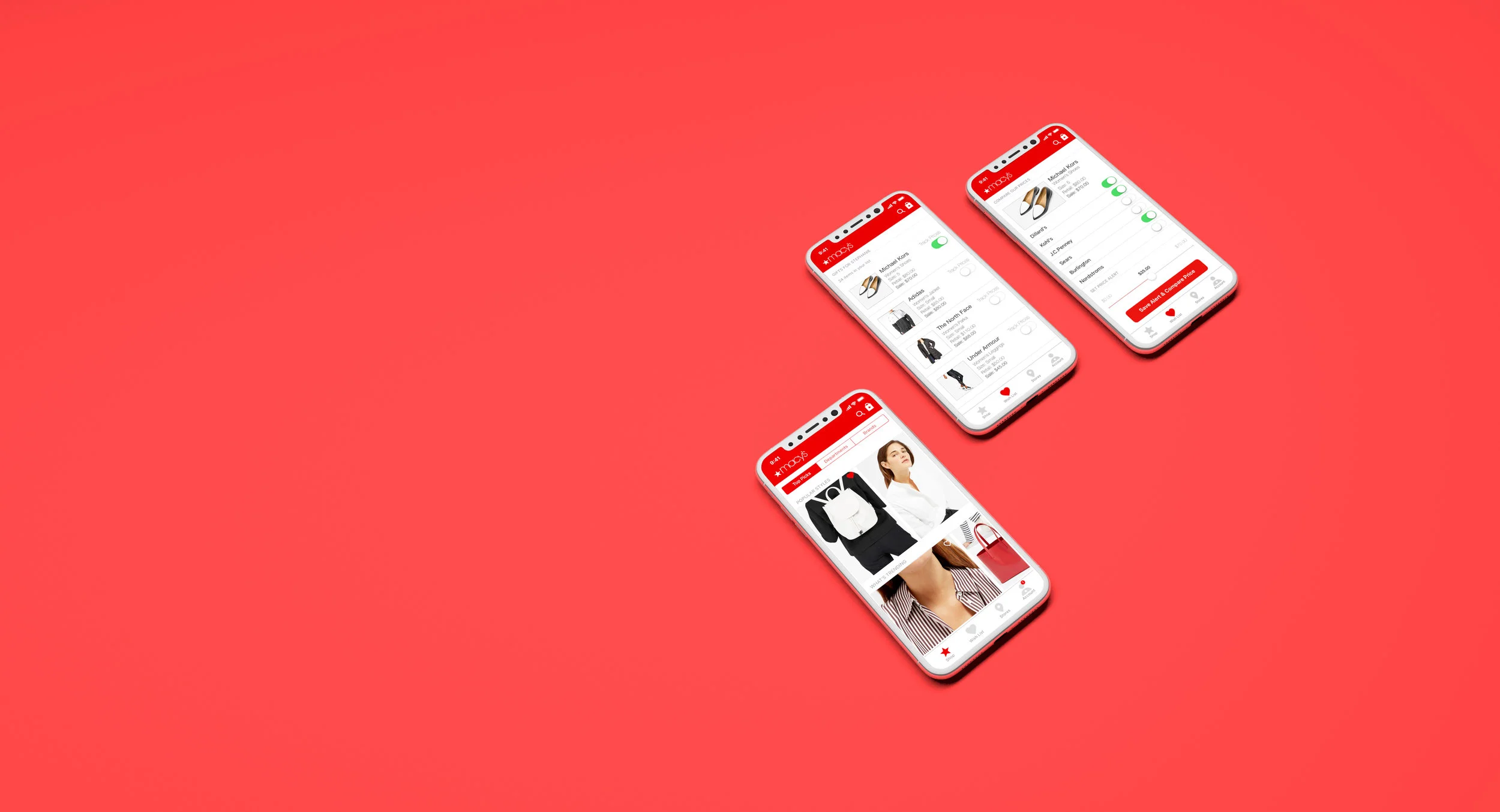
From left: Click-through sequence showing revised price alert & comparison design
In our last round of usability testing with the paper prototypes, we realized that it was difficult for the users to locate the new price alert and comparison features. Since they were buried in the wish list tab bar, we decided to make the new feature more visible by adding a “Compare Price” button within the product pages. This would then provide a secondary entry point for less frequent users.
From left: Click-through sequence displaying integration of comparison shopping features for improved findability.
VISUAL DESIGN

Visual design by Shruti Arora at project due date.

Visual design by Sunny Lee, 2 weeks after project completion.
NEXT STEPS
- Create an analysis tool that would allow Macy's to gain further insight in how to best customize users' browsing experiences.
- Develop a user flow and sequence around guest check-out
LESSONS LEARNED
- This being our first group project, we learned a lot about process, how our roles affected each other and what and when deliverables and assets needed to be passed back and forth to meet our stakeholder presentation deadline.
- Finding ways to contribute to the group at all times took getting used to, but luckily our team was filled with hard-working creatives and we were able to stay on track and get the job done!
- Prototyping and usability testing was the most effective way to gain meaningful feedback.